Why Design Comes Last

“Design comes last? But, I want my site to look nice, attract potential clients and be a visual representation of my company. Shouldn’t design be one of the first things to discuss when talking about upgrading my website?”
I know what you’re thinking: you can’t understand why the Lead Designer at Juicy Results would want to put design last. It’s hard to fathom how someone whose thinking is supposed to revolve around visual appeal could even consider this notion. You think that as a designer, I should believe creating the best, most original, most attractive design possible is one of the most important parts of the process. And you know what? I do.
Ok, so now you’re really confused. How can a person claim to believe so strongly in the importance of a great design but also believe design should come last? Allow me to explain…
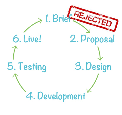
Most people who have had experience working with a designer have some expectations for how the design process works. You probably imagine it should look something like this:

The truth of the matter is, following these steps leaves little room to turn your site into something that can really work for you. It’s relatively easy to pick some colors and choose some images that look pretty. But is that really what’s best for the client? How do I know that I’m coming up with a design that suits the clients needs? How do I know what’s really important to a client? How do I decide where to create focus? The answer is: if I create a design before getting a real handle on these questions then I don’t know.
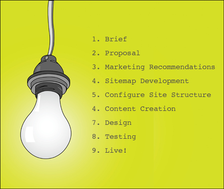
A website needs to be more than just a pretty face; it needs to be a tool that helps guide users through the website and ultimately helps the client achieve their goals. The only way to know how to design a site that can really work for the client is to create the design as one of the final steps in the process. Before I can come along and make everything look pretty I need some real information about what a client’s needs are and in order to do that I need a plan. If I am going to create a useful, well-thought-out website the design process should follow these steps:

Following the steps above allows me to take away virtually all of the guess work when it comes time to create the design. Instead of filling up a design comp with fake titles and filler text I can use all the information we’ve already gathered from a client to make a more comprehensive, well thought out vision of not just what a website would look like but how it will function. I can use the real content that is going to be on the site to make appropriate calls to action which will guide people to connect with the company, fill out important information, or sign up for newsletters. I can use the sitemap to know where the most important information on the site is going to live and I can use that information to help guide a user deeper into the site. I can know where to place different ‘content buckets’ because I know what the content is. It really is a way to allow a designer to work in a more meaningful and productive fashion.
It’s easy to imagine how a designer can create a website that is more useful and more complete by following the steps above instead of rushing out a design at the beginning of a project. Good design comes from good, well thought out information: it relies on a solid knowledge of the company you are designing for and deeply considered, structured content that the design can be built around. The design of an entire website isn’t something that should just be pulled out of thin air; it’s not reasonable to believe that all the important information that makes up a useful website can just be forced to fit into a pre-conceived design. But it happens all the time. That’s just not the way I like to work, and it’s why I think design should come last.


Jeremy Pound
June 19, 2012 at 11:02 am
Great way to demonstrate why we take this counterintuitive approach to designing websites, Angela. The design is about maximizing results, not just making it look good.
Adrienne Airhart
June 19, 2012 at 6:06 pm
Excellently done, Angela. I am constantly amazed at how you not only turn a client’s spoken words into a visual representation of their brand but also design around the content to seamlessly blend their message and the look and feel of their site as a unit. Bravoooooo!!
Lissett
June 28, 2012 at 2:27 pm
Couldn’t agree any more!
Lisa Hutt
June 28, 2012 at 3:05 pm
Lissett, great to hear from you and that you, another awesome designer agree!
Suzi
June 29, 2012 at 11:49 am
Yep, this is a great post. It’s a unique approach with a focus on CONTENT first, then creation of a compelling design that compliments the message. So you enhance the visitor’s visual experience yet stay true to the website’s marketing goals. Thanks for explaining the process!
Pingback: Make Your Facebook Ads Perform Better - Experiment and be brave.